Websites, events and customer systems in Japan
Building a visual identity for a business in Japan
A visual identity works when people recognize it everywhere you appear. How to build one for a Japan business, from bilingual type to meishi, LINE and the web.
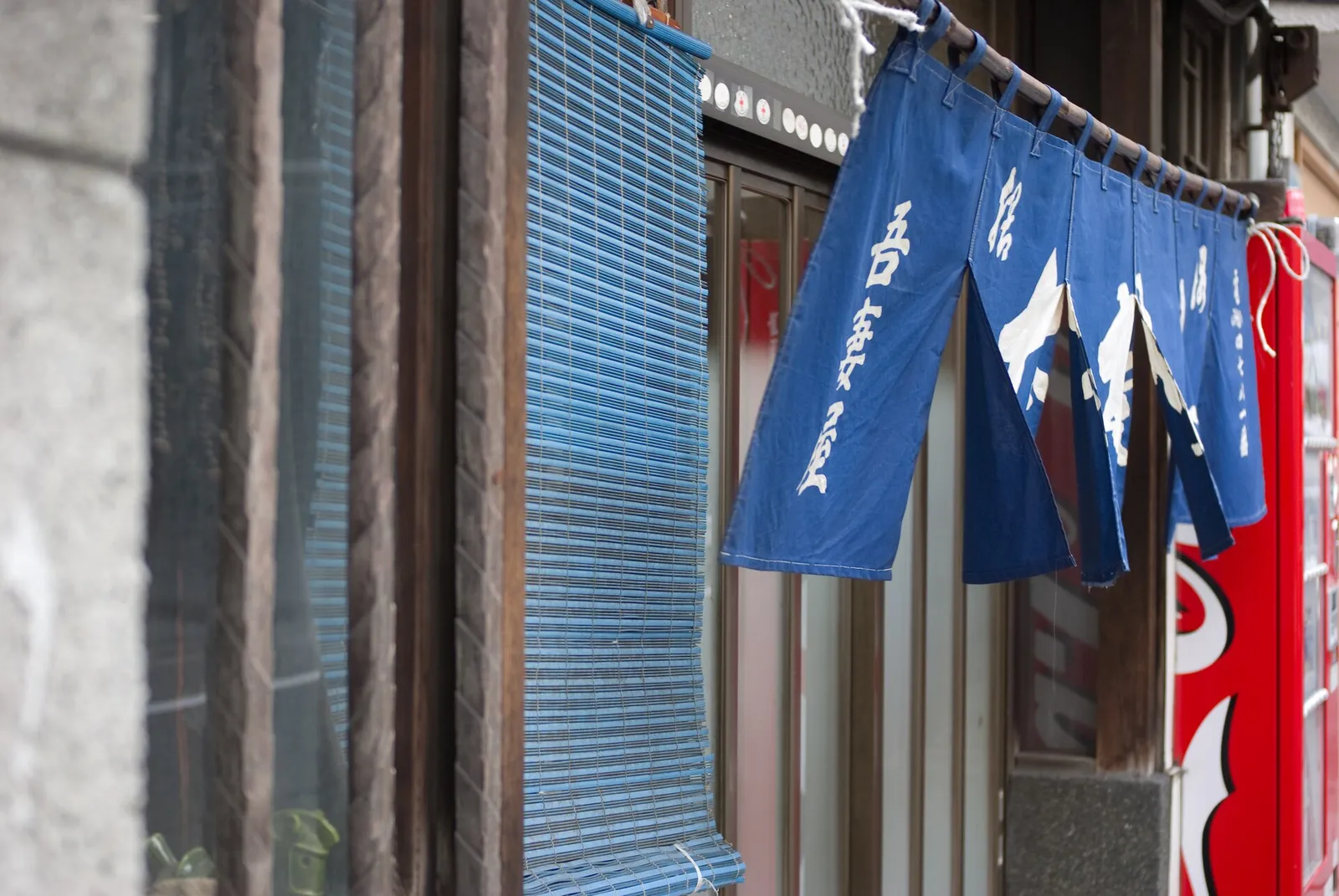
![[cipher] on Wikimedia Commons (CC BY-SA 2.0)](https://commons.wikimedia.org/wiki/File:Soba_restaurant%27s_noren_by_-cipher-_in_Uguisudani,_Tokyo.jpg)
A visual identity is the set of choices that lets people recognize you before they read a word: color, type, imagery, and the way those things repeat across every place you appear. For a business in Japan, it has to work in two scripts, on small screens, on a printed 名刺 (business card), in a LINE chat and on a storefront sign, and it has to stay consistent when several people and vendors are producing material. The design matters, but consistency is what makes it recognizable.
I think about this partly because of what I wear. My sunglasses are custom Oakleys with a bright red frame and mirrored orange lenses, and I often wear shirts printed with the work of the artist Tetsunori Tawaraya, whose characters are loud, surreal and hard to ignore. Neither began as a plan. Over time they became a uniform. The glasses are hard to forget, and the shirts start conversations. That is a small, personal version of what a business identity should do: make you easy to recall and give people something to talk about.
What is a visual identity, and how is it different from a logo?
A logo is one asset. A visual identity is the system around it:
- a logo in the versions you actually need (horizontal, stacked, small icon, Japanese and English)
- a short color palette with exact values for screen and print
- one or two typefaces that cover both Japanese and Latin text
- a photography or illustration style
- rules for how these combine on a web page, a slide, a flyer and a social post
The test is recognition. If someone sees your Instagram post, your email newsletter and your shop sign in the same week, they should know it is you each time without looking for the name.
Why is branding in Japan harder than it looks?
Several things specific to Japan make an identity easy to break.
Two scripts at once
Most Japan businesses present in Japanese and English, often on the same page. A typeface that looks sharp in English may have no Japanese glyphs at all, so the browser or printer substitutes a default font and the page looks like two different companies. Choose a Japanese typeface first (Noto Sans JP and other Google Fonts families are free and render well on screen; commercial families from Morisawa and others are common in print) and pair a Latin face that sits comfortably beside it. Check font licenses before you use a typeface on a website, in an app or in printed packaging, because desktop licenses often do not cover web use.
Dense surroundings
Japanese retail streets, train advertising and websites are visually busy. A quiet identity can disappear, and a loud one can look like everything else. What cuts through is usually a single distinctive element used consistently: one color, one shape, one kind of image. My red frames work for the same reason.
Many small surfaces
A Japan business appears in more small formats than you might expect: the 名刺, a LINE official account icon, a Google Business Profile photo, a receipt, a noren or sign, a Peatix event page, a PDF quote. Each has size limits and its own cropping. An identity that only works as a large website header will fall apart on a 91 x 55 mm card or a round profile image.
Several producers
Printers, web agencies, freelance designers, staff making slides in PowerPoint and part-timers posting on Instagram all produce material. Without shared files and simple rules, each one drifts a little, and after a year the brand has five shades of the same color.
How do you build a visual identity that stays consistent?
The creative choices are the enjoyable part. The operational side decides whether they survive.
Start from what should be remembered. Decide the one or two things you want people to recall after meeting you or visiting your site. Everything else supports those.
Design for the smallest surface first. Make sure the logo and color work on a profile icon and a business card before approving the website version.
Write a one-page guide. Colors with exact values, typefaces with where to get them, logo files and when to use each, and a few examples of correct and incorrect use. A long brand book nobody opens is less useful than one page everybody has.
Keep the files in one place. Put master logos, fonts, templates and approved photos in a shared folder in Google Drive, or in a Canva brand kit if your team makes most material there. Name files clearly. When a printer or agency asks for the logo, send the link to that folder, not an old attachment.
Build templates for repeat work. Slides, quotes, event pages, social posts and email signatures should start from a template, so staff never design from a blank page.
Carry it through the digital systems. Your website, email signatures, booking pages, payment receipts, newsletter tool and LINE account should all use the same name, logo and colors. A customer who books through a generic-looking form after visiting a carefully designed site feels the drop in quality.
Give it an owner. One person approves new material and updates the guide. This takes a few hours a month, not a department.
Can a distinctive identity work in conservative Japanese business settings?
Yes, if the work behind it holds up. A bold identity gets you remembered at the first meeting, and it raises expectations. If the proposal is late, the site is broken or the invoice is wrong, the memorable introduction becomes a memorable disappointment. The identity makes a promise, and the operation has to keep it.
It also helps to separate expression from reliability. Your color, imagery and tone can be as bold as your market tolerates. Your documents, invoices, contact details and bookings should be plain, accurate and easy to use. Japanese clients in particular notice when the details are right: the correct company name in katakana and English, matching addresses across the site and the 名刺, and invoices that include your インボイス registration number.
Where a visual identity meets your website and tools
Most identity problems I see in small businesses are not design problems. The logo lives in one designer’s inbox, the website was built by a different agency with a different font, the booking page uses the platform’s default styling, and nobody knows who has the original files. Fixing that is part of setting up the business’s systems properly, and it shows from outside: a company website reveals a lot about whether anyone owns these details.
If you are rebuilding a website or connecting bookings, payments and email, that is the right moment to bring the identity into every tool customers touch. I can plan and carry out that work with your designer and team. If you need photography, video and page-ready material that match the identity, see Media Production. For an informal conversation, get in touch.
Further reading: room for psychedelic art in a professional identity · making music and design with Thom Smith · what a company website reveals about the business behind it · digital business cards and networking in Japan